


Hannah Gallop

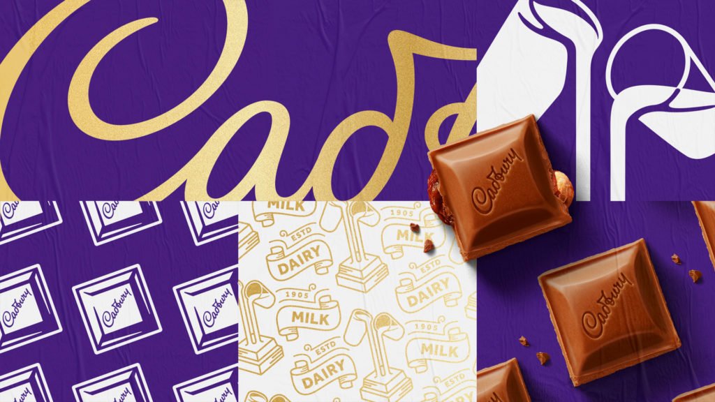
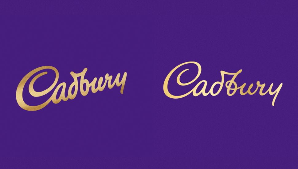
The new design was directed by international design studio Bulletproof, who have redrawn the Cadbury wordmark (commonly referred to as a logo) to honour the company’s original signature.
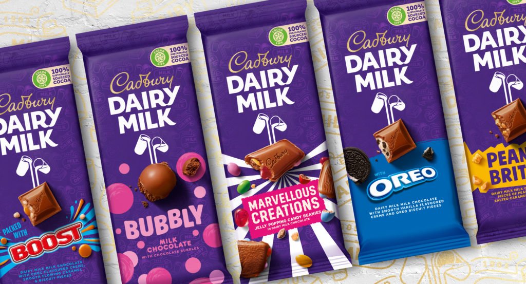
Simultaneously, Cadbury’s iconic chocolate series Dairy Milk has been given a much bolder new image with capitalised logotype, a new pattern on its wrapper, and a redrawn “Glass and a Half” icon.
The new global brand identity for the much-loved British confectionary company aims to put a “distinctive and modern twist” on Cadbury’s heritage, as it looks to emulate the philanthropy of its founder, John Cadbury.
Bulletproof’s Global Creative Director, Nik Rees, says: “The old design has been very successful but over time had failed to reflect the quality and care that lies at the brand’s roots. When looking back into the archives at Cadbury Bournville, we were ultimately inspired by the founding principles of John Cadbury.”
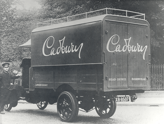
William’s signature first made a commercial appearance for the brand on the back of Cadbury trucks in the 1920s.
“The Cadbury script had become polished and too refined over the years,” Rees said, “so we put the humanity back into it by making it what it always was… a signature.”
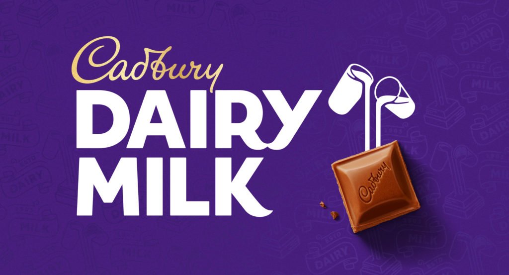
Unlike the previous version of the icon, a piece of chocolate has been included in the mark. This chunk of chocolate helps consumers to recognise the connection between ingredients and the product, explains Bulletproof.
The Dairy Milk logotype now comprises an all-caps and heavier typeface that has been recrafted from the original packaging for the chocolate bar from 1905.
Drawing further inspiration from the 1905 bar, the team also created a “distinctive Dairy Milk pattern” which is subtly featured on the purple background of all product packaging. The aim is to give “greater depth and purpose” to the Cadbury purple and provides an “element of discovery”.
The project cost a total of £1million which has provoked feelings of animosity and plenty of ‘but it looks identical to the old logo’ remarks. While the price tag may seem like a lot for some, Barques designer Scott Heeks joins the many other marketers and designers who are defending the cost.
“For consumers, it’s hard to imagine what’s involved in creating something unique that appeals to a very broad demographic and is taken for granted day-in, day-out but encourages them to choose Dairy Milk over another brand. That’s branding!” says Scott.
Although many are seeing the brand overhaul as ‘just a new logo’, behind the visual aspects there is a lot more happening. Scott adds, “Branding is much more than what you see on the surface and certainly more than ‘just a logo’. Branding is a combination of factors, some obvious, and some not, that help to persuade you into making that all-important decision – which bar of chocolate do I want today?”
It is also worth noting that the £1m investment in the new identity and packaging cost just 3.1% of Cadbury’s pre-tax profits from 2019. While the lump sum of £1m may seem like a costly investment, this is the first rebrand the confectionary giant has had since the 1960s. If this new look were to last for another 50 years, this investment equates to just £20k per year – a ‘bargain’ by anybody’s standards for a new global identity.
From its regal purple brand colours to its longstanding “Glass and a Half” logo, Cadbury is an instantly recognisable brand with fans from across the globe. Having already earned the title of ‘the world’s favourite chocolate’, was the brand overhaul worth it?
“Absolutely” says Scott, “I think they’ve nailed it!
“From the re-imagining of the Glass and a Half icon, the crisp refresh of the Cadbury logo, that in essence is the same, but very different in subtle ways (and not easy to achieve), through to the bold new Dairy Milk font which is both playful and strong – a real statement of intent and one that will carry the brand forward to existing and new consumers – I think Cadbury have added an extra ingredient into the mix.
“My favourite feature of the rebrand is the use of photographed products and ingredients as part of the typographic treatment of the bar name. It brings the brand to life and gives the packaging a visual impact that makes you feel like picking it up and scoffing the lot! In a tough market and with so much choice out there, the rebrand has achieved something special combining heritage, modernity, vibrance, impact and shelf appeal to a truly iconic product that has been on our shelves since its launch in 1905.”
Barques’ Creative Director, Lee Haynes agrees, saying, “I love it! It’s refreshing, up to date, yet pays a nod to their history at the same time. The extended branding with the new type styles is nice too.”
Does Cadbury’s new look make you want to give it a ‘twirl’ or instead will you take a ‘time out’ and look towards its competitors?
Consumers in Australia will be the first to see the new brand identity when it hits the shelves down under next month, followed by South Africa and Malaysia later in the year and the UK and Ireland at the start of 2021.